


A poor website navigation structure quietly taxes every acquisition channel. Shoppers hit a broad homepage, cannot locate the right collection, abandon the journey, and the store pays again to win their attention elsewhere.
The old view treats navigation as a website design decision. High-performing Shopify and WooCommerce stores treat it as revenue infrastructure: a connected system that surfaces commercial pages, strengthens internal links, reduces mobile friction, and gives search engines a coherent view of the catalog.
That distinction matters most as SKU counts, seasonal collections, buying guides, and support content expand. A neat-looking menu can still hide your best categories three layers deep, fragment authority across duplicate filter URLs, and leave customers unsure where they are.
What Is Website Navigation Structure?
Website navigation structure is the way a website organizes pages, categories, and internal links so users and search engines can understand what content exists, where it belongs, and how to reach it.
It is bigger than the navigation menu. The menu is one visible interface. The structure underneath includes taxonomy, URLs, category relationships, breadcrumbs, internal search, filters, footer links, contextual links, and the paths shoppers take from a need to a product.
Information architecture is the planning layer. Navigation is the visible system people use to move through it. Nielsen Norman Group explains the difference between information architecture and navigation clearly: one organizes content; the other exposes that organization to people.
For an eCommerce store, that means a collection page should not exist merely because the merchandising team created it. It needs an obvious parent category, descriptive pathways from related pages, and a defined role in product discovery and organic search.
Why Navigation Structure Matters for User Experience, SEO, and Revenue
Navigation failure creates a chain reaction. A shopper who cannot find compatible accessories, delivery details, or a product category is less likely to browse, add to cart, or return. Meanwhile, a crawler that reaches key collections only through scattered campaign links gets weaker structural signals about their importance.
Clear internal links help distribute discovery and context across a site. Learn how internal links help search engines discover and understand pages, then apply that principle to category hubs, buying guides, related collections, and product families.
The commercial impact is direct enough to measure. Track category-page entrances, internal-search refinements, product-listing-page conversion, exits from menus, and the organic revenue associated with each collection. Navigation is not a cosmetic improvement when these numbers move.
Reality check: 94% of people identify easy navigation as the most useful website feature. For a store, “easy” means shoppers can recognize the right path quickly, not that every page appears in the header.
Start With Information Architecture Before Designing the Navigation Menu

Menus built before the catalog is mapped usually become political. Every department asks for a link, every campaign gets a temporary landing page, and no one owns the customer-facing hierarchy.
Start with a content and catalog inventory. List product departments, categories, collections, product types, buying guides, comparison pages, support content, account tasks, and policy pages. Then classify each item by shopper need, search demand, margin, conversion performance, and strategic importance.
A practical hierarchy might look like this:
- Home → Shop by Department → Product Category → Collection → Product
- Buying guides → linked to the relevant category and collection
- Support content → shipping, returns, sizing, compatibility, and account help
- Campaign pages → connected to permanent category paths, not left isolated
Use consistent naming as the store grows. “Running Shoes” and “Trail Running Footwear” may describe the same commercial area, but splitting them across menus, URLs, and filters creates uncertainty for shoppers and systems alike.
User research should settle disputed labels. Card sorting is useful because it reveals how buyers group products before internal teams impose their own terminology. Use card sorting as a way to validate category groups and labels with real customers, sales teams, and support-ticket language.
Choose the Right Website Structure Model
Most stores need more than one structure model. The core catalog generally needs a hierarchy, while search, filters, guides, and recommendation modules add alternate routes for users with different levels of intent.
The four core website structure types are hierarchical, linear, matrix, and database or dynamic. A hybrid model combines them, which is the practical default for most eCommerce businesses.
| Structure model | Best use case | Strength | Risk | eCommerce relevance |
|---|---|---|---|---|
| Hierarchical/tree | Departments, categories, collections | Establishes clear parent-child relationships | Can become too deep | The foundation for most catalogs |
| Linear/sequential | Checkout, quizzes, onboarding | Keeps a task focused | Poor for open-ended browsing | Useful for guided purchase flows |
| Matrix/web | Editorial hubs and related resources | Encourages exploration | Can dilute priority without controls | Useful for guides, comparisons, and inspiration |
| Database/dynamic | Large, attribute-rich inventories | Lets users query and filter inventory | Can create duplicate crawl paths | Essential for filters and internal search |
| Hybrid | Established stores with broad catalogs | Matches real shopper behavior | Requires governance | Usually the strongest model |
A furniture retailer, for example, may use a hierarchy for Living Room → Seating → Sofas, a dynamic filter system for fabric and size, and contextual links from a “How to choose a sofa” guide into relevant collections. Each route has a different job. Together, they reduce friction.
For a fuller structural lens, consider how does site structure affect ecommerce seo when deciding which collection pages deserve permanent, indexable positions in your architecture.
Keep the Hierarchy Flat Enough to Support Discovery
Depth becomes expensive when it adds no decision value. If a shopper must move through “Shop,” “All Products,” “By Room,” “Living Room,” and then “Sofas” to reach a core collection, at least one layer may be redundant.
A flatter hierarchy does not mean placing every collection in main navigation. It means making important destinations reachable through logical, descriptive routes and removing unnecessary overview pages. Nielsen Norman Group explains why flatter hierarchies can make content easier to find.
Do not turn the three-click rule into a KPI. Research has found that users are not necessarily more likely to abandon a task after three clicks than after 12. The better standard is whether each click feels expected, informative, and productive.
Audit pages that receive organic impressions or convert well but have weak internal access. A high-margin collection buried behind generic pages is a priority. So is a buying guide that receives search traffic but never moves readers into relevant product decisions.
Build an eCommerce Website Navigation Structure Around Shopper Tasks
Shoppers do not think in your internal org chart. They arrive to browse, search, compare, check compatibility, assess delivery, reorder, or solve a problem. A strong eCommerce website navigation structure supports each task without forcing one path on everyone.
Prioritize product departments, high-demand collections, search, cart, account access, help, and trust information based on actual behavior. A new visitor might enter through a buying guide. A returning customer may want account access or a specific product line in one tap.
Category and collection pages should be reachable through logical, descriptive paths rather than isolated campaign links. Strong navigation SEO connects those permanent commercial hubs to supporting guides, product pages, and adjacent collections without relying on temporary promotional routes.
Buried collections are often both a UX and technical SEO issue. SEO.DIGITAL’s Shopify and WooCommerce technical SEO audits identify navigation, internal-link, and crawlability problems that can limit organic revenue before teams spend months redesigning the interface.
Use Baymard’s eCommerce navigation research as a reminder that category scope and current-location cues matter. Shoppers should know whether they are browsing a department, a narrower category, or a filtered result set.
Plan the Main Navigation and Menu Labels
The header has limited attention and screen space. Give it the jobs that matter most: product discovery, primary commercial paths, search, cart, account access, and essential support or brand context.
Five to seven top-level items is a useful starting heuristic, not a law. A narrow catalog may need fewer. A broad retailer may need a compact top-level structure with a well-designed mega menu underneath.
Use labels customers already recognize. “Shop,” “Men,” “Women,” “New Arrivals,” “Help,” and “Sale” are clearer than “Explore,” “The Edit,” or internal collection names that mean nothing to first-time visitors.
Order links by shopper value, not stakeholder seniority. If a product department drives demand and revenue, it deserves more prominence than a low-traffic corporate page. Keep the same labels and placement across key templates so repeat visitors do not need to relearn the user interface.
A seo friendly website also aligns menu labels, headings, breadcrumbs, and internal anchor text around the real terms shoppers use. That consistency helps people scan faster and reinforces the meaning of category pages.
Use Dropdown Menus and Mega Menus Only When They Clarify Choice
A dropdown earns its place when it reduces ambiguity. A mega menu earns its place when a large catalog needs visible grouping, scannable headings, and multiple meaningful routes from a single department.
For a beauty retailer, a useful mega menu may group links like this:
- Shop by category: Skincare, Makeup, Haircare, Fragrance
- Shop by need: Sensitive Skin, Acne Care, Travel Sizes
- Featured collections: Best Sellers, New Arrivals, Gift Sets
- Decision support: Shade Finder, Routine Builder, Delivery Information
Make parent categories clickable. “Skincare” should lead to its main collection even if it also opens a panel of subcategories. Avoid turning every menu panel into a dense link directory, especially when links have no explanatory heading or commercial purpose.
Do not use hover as the only way to reveal choices. Desktop users may manage it; keyboard and touch users will not. Controls need clear states, adequate spacing, and predictable behavior.
Use Search, Filters, and Internal Links as Navigation Systems
Menus cannot carry a large catalog alone. Internal search serves high-intent shoppers who know what they want, while faceted navigation lets browsers narrow a category by attributes such as size, color, material, price, or compatibility.
Treat filters as both a merchandising system and an SEO governance issue. Some filter combinations may deserve indexable landing pages because they match sustained search demand. Others create thin, duplicate, or near-infinite URLs that waste crawl attention and dilute internal-link signals.
Contextual links should help shoppers move from an informational guide into the most relevant collection or product decision. For example, a guide about choosing waterproof hiking boots should link naturally to waterproof boot collections, sizing help, and compatible care products.
Internal links are the connective tissue that menus cannot provide. Add them in category copy, buying guides, comparison pages, related-category modules, and product recommendations, but keep the destination genuinely useful to the current task.
Add Supporting Navigation: Breadcrumbs, Footers, and Local Links
The header does not need to do everything. Supporting navigation gives shoppers orientation and alternate routes without overloading the main navigation.
Breadcrumbs show where a page sits in the hierarchy. Local links move visitors between related subcategories, guides, and product families. Footer navigation handles lower-frequency but high-importance paths such as returns, policies, contact, delivery, and help.
Use Breadcrumb Navigation to Show Location and Hierarchy
Breadcrumb navigation is especially valuable when a shopper lands on a deep collection or product page from search. A trail such as Home > Outdoor > Hiking > Waterproof Boots confirms the current scope and offers an immediate route upward.
Use clickable, descriptive labels that match the real hierarchy. Add BreadcrumbList structured data so search engines can better interpret the page relationship, but do not use breadcrumbs to conceal a confusing category tree.
Current-location indicators matter in menus, too. Baymard research reports that 91% of eCommerce sites fail to highlight the shopper’s current location in the main navigation, a small omission that can make a broad catalog feel disorienting.
Design Footer Navigation for Secondary Paths and Trust
A footer is a utility layer, not a dumping ground. Group links into clear clusters such as Help, Customer Care, About, Legal, and Resources, then include only pages that help buyers complete a task or assess trust.
Useful footer links commonly include shipping and returns, contact details, sizing, warranty, privacy, terms, careers, and a selected set of high-value guides. Do not duplicate every category and product page just because space is available.
Footer navigation can also surface resource hubs that support organic discovery. Keep the hierarchy visible and intentional, particularly where buyers need reassurance before completing a purchase.
Make Mobile Navigation Responsive, Fast, and Easy to Use
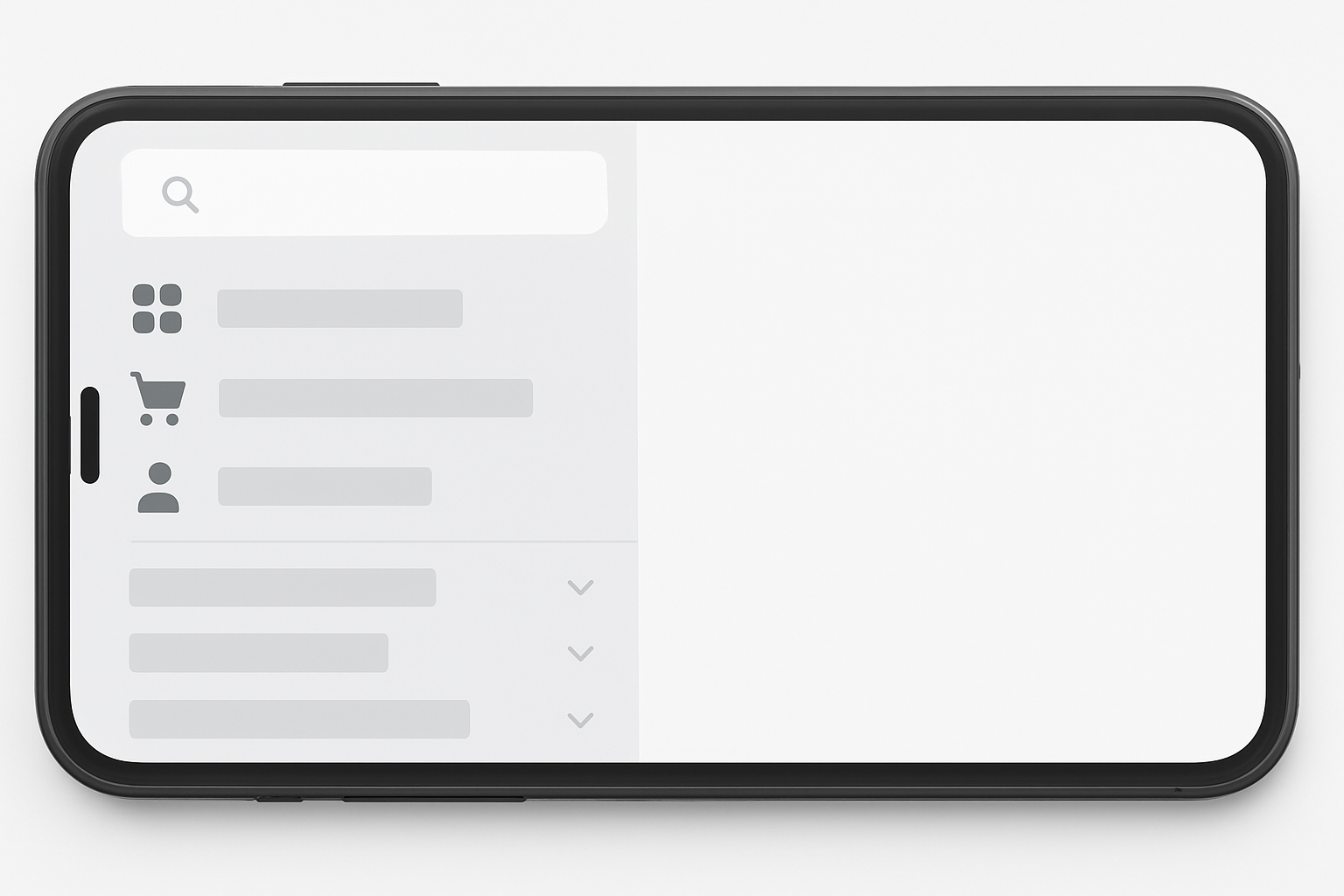
Mobile traffic is the default context for many store visits, not a secondary layout to check at the end. The global mobile share of website traffic makes one point clear: a desktop mega menu compressed into a narrow drawer is not a mobile strategy.
Prioritize the routes mobile shoppers use most. Search, cart, account, top product departments, and help should be quick to reach. Large menus need expandable groups, strong visual hierarchy, and tap targets that do not punish thumbs.
Use at least 44 by 44 pixels for touch targets where possible. Test menu opening speed on physical devices, slower connections, and smaller screens. Heavy promotional imagery inside navigation can delay interaction and obscure the actual choices shoppers came to make.
Select the Right Mobile Navigation Pattern
Choose a pattern based on catalog complexity and repeat behavior, not fashion.
- Hamburger-only menu: Works for smaller catalogs where search and cart remain visible.
- Hybrid header: Keeps a few high-value actions, such as search and cart, exposed while the drawer holds deeper paths.
- Off-canvas drawer: Fits broad category trees when sections expand in place and preserve context.
- Full-screen overlay: Useful for focused browsing when hierarchy needs more visual room.
- Bottom tabs: Best for repeat-use stores with a few stable destinations, such as Home, Search, Categories, Account, and Cart.
Keep expandable sections closed by default only when labels reveal enough value to encourage a tap. Make the current path obvious after a user drills into a department, and ensure the back action is clear.
Make Navigation Accessible for Keyboard and Screen Reader Users
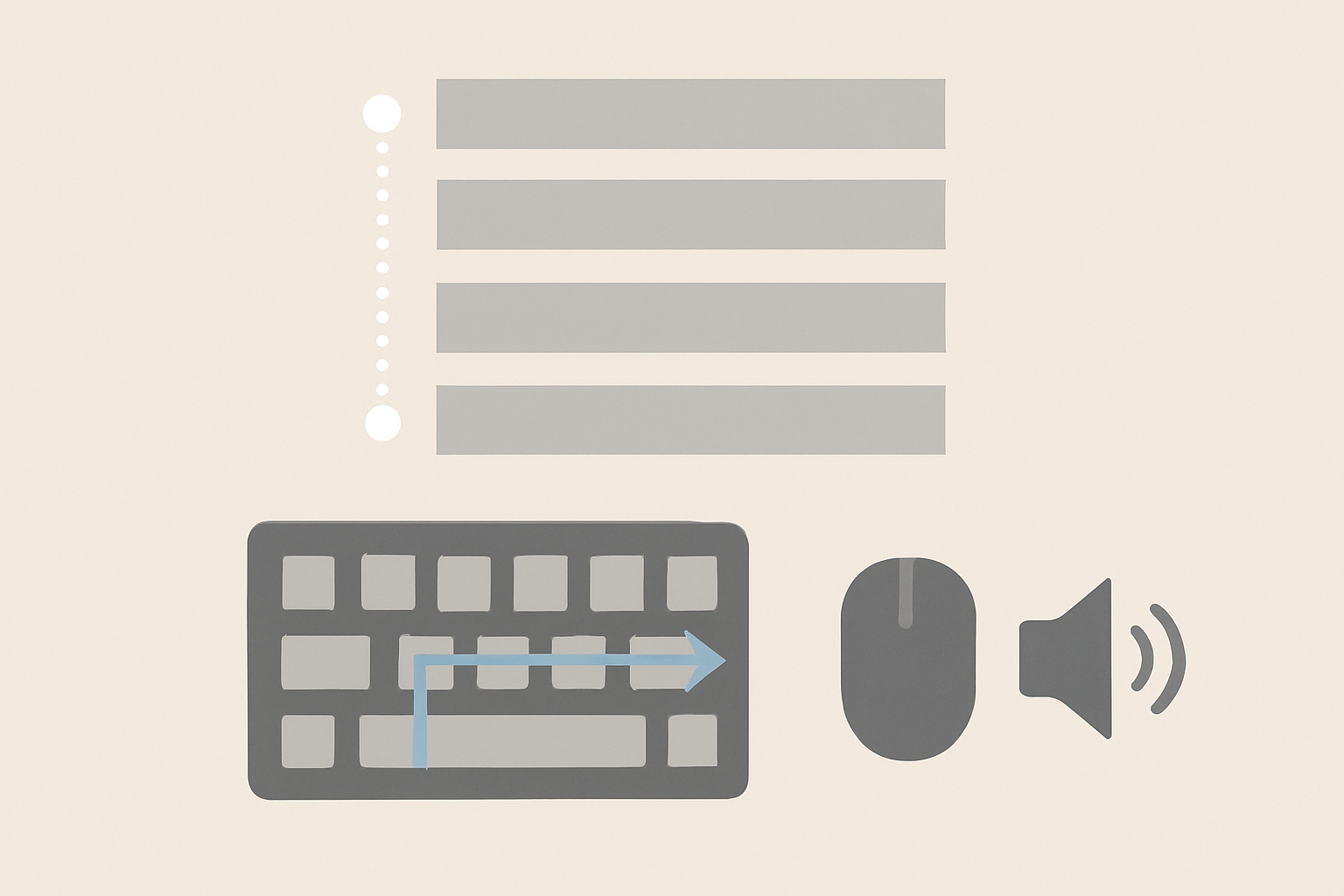
Accessibility defects turn basic browsing into a blocker. If a menu requires hover, hides focus, traps the keyboard, or announces vague icon controls, the store excludes people who need another interaction method.
Build on semantic HTML first. Use a <nav> landmark with a logical list of links, then add JavaScript only to enhance interaction. A basic navigation list that works without scripts is more resilient than a visually polished control that fails when behavior breaks.
Use buttons for controls that expand and collapse panels, and links for destinations. Do not label ordinary site navigation as an ARIA menu; that pattern implies a different keyboard interaction model than most website menus require.
Accessibility Checklist for Main Navigation
- Use semantic regions with
<nav>, lists, links, and clearly labelled landmark areas. - Support keyboard operation for every destination, submenu trigger, close control, and search function.
- Show visible focus with
:focus-visible, and never rely on hover-only dropdown behavior. - Communicate state changes through
aria-expanded,aria-current="page", and meaningful labels for icon-only controls. - Test real behavior with keyboard-only browsing, screen readers, hidden-menu focus checks, and
prefers-reduced-motionenabled.
Accessibility testing should happen before launch and after platform, theme, or app changes. Test the desktop header, mobile drawer, search, filters, cart utilities, and all breakpoint transitions.
Audit and Improve Your Website Navigation Structure
Navigation work fails when teams jump straight to visual mockups. Start with evidence, map the current system, and make changes in an order that protects high-value organic paths.
Follow this audit sequence:
- Set commercial goals. Identify high-margin, high-demand, high-conversion, and strategically important collections.
- Inventory the estate. Capture categories, collections, products, guides, filters, support pages, and campaign landing pages.
- Map current pathways. Document parent-child relationships, internal links, navigation labels, breadcrumbs, and mobile behavior.
- Find structural waste. Flag orphaned pages, duplicate category routes, overly deep paths, broken links, and filter combinations with little value.
- Test real tasks. Ask users to find a product type, compare options, locate returns information, and reach checkout on desktop and mobile.
- Protect the migration. When URLs change, plan redirects, update internal links, validate canonicals, and monitor indexation after launch.
- Measure outcomes. Compare organic entrances, category engagement, internal-search use, conversion paths, crawl coverage, and revenue after deployment.
Tailored review: Qualified Shopify and WooCommerce brands can request a tailored site-health and navigation review from SEO.DIGITAL to identify high-impact technical SEO and structural opportunities.
Use Research and Analytics to Prioritize Changes
Analytics should resolve arguments about which pages belong in main navigation. Use GA4 Path Exploration to see where users actually go after key landing pages, then compare that behavior with site-search queries, customer-support questions, conversion data, and paid-search terms.
Start by using Google Analytics to understand user paths, then identify whether important category pages are being reached through clear internal journeys or only through direct and paid traffic.
Customer-support tickets often expose missing routes. Repeated questions about compatibility, sizing, delivery, or returns signal that key information is hard to find at the moment shoppers need it.
Use attribution reporting for identifying important conversion paths before demoting a guide, collection, or local-navigation module. A page with low last-click revenue may still introduce profitable shoppers to a category they purchase later.
Watch for Common Navigation Problems
The following issues are common on stores that have grown faster than their information architecture. Treat them as operational defects, not design preferences.
| Problem | What it costs | Direct corrective action |
|---|---|---|
| Overloaded header | Choice overload and weak scanning | Consolidate around departments and high-value tasks |
| Vague labels | Misclicks and missed categories | Replace brand language with descriptive shopper terms |
| Deep category tree | Buried collections and weak discovery | Remove redundant layers and link priority hubs directly |
| Duplicate paths | Confused users and diluted signals | Establish one primary route for each core category |
| Orphaned collection pages | Lost organic and internal traffic potential | Add links from parent categories, guides, and related collections |
| Image-heavy menus | Slow interaction, especially on mobile | Reduce media weight and preserve text-first access |
| Inaccessible dropdowns | Excluded users and failed task completion | Support keyboard use, visible focus, and explicit states |
| Footer clutter | Low-value links obscure trust content | Group and prune secondary destinations |
Re-audit after major merchandising changes, collection launches, theme updates, and migrations. Navigation debt accumulates through small decisions, so governance matters as much as the initial website structure diagram.
Frequently Asked Questions About Website Navigation Structure
What Are the 7 C’s of a Website?
The 7 C’s framework varies by source, so there is no universal version. For navigation, use clarity, consistency, content, context, convenience, credibility, and conversion as practical evaluation lenses: can users understand choices, trust the store, and complete the right task?
What Are the Four Types of Website Structure?
The four core website structure types are hierarchical or tree, linear or sequential, matrix or web, and database or dynamic. Most eCommerce stores use a hybrid structure that combines a category hierarchy with search, filters, and contextual internal links.
What Are the Four Types of Navigation?
The four common navigation types are global, hierarchical, local, and contextual navigation. A store can use all four at once through a global header, category menus, local collection links, breadcrumbs, and in-content product links.
What Are the Different Types of Website Navigation?
Visible navigation patterns include horizontal navigation bars, dropdown menus, mega menus, hamburger menus, vertical sidebars, breadcrumb navigation, footer navigation, and search. The right pattern depends on catalog size, shopper tasks, device behavior, and how much hierarchy users need to see.
Build a Navigation Structure That Supports Long-Term Organic Growth
A website navigation structure is never finished because the catalog, customer questions, search demand, and commercial priorities keep changing. The strongest stores review their hierarchy before launching new collections, protect internal links during redesigns, and validate mobile and accessibility behavior as carefully as desktop visuals.
Prioritize the pages that serve real shopper intent and profitable organic growth. That means indexable collection hubs, clear category labels, useful filters, resilient search, contextual links, visible location cues, and technical safeguards that help search engines interpret the store.
Shopify and WooCommerce brands generating $50k+ MRR can book a call with SEO.DIGITAL for a no-obligation deep-dive into navigation, crawlability, content, authority, and the organic revenue opportunities currently hidden in the store structure.